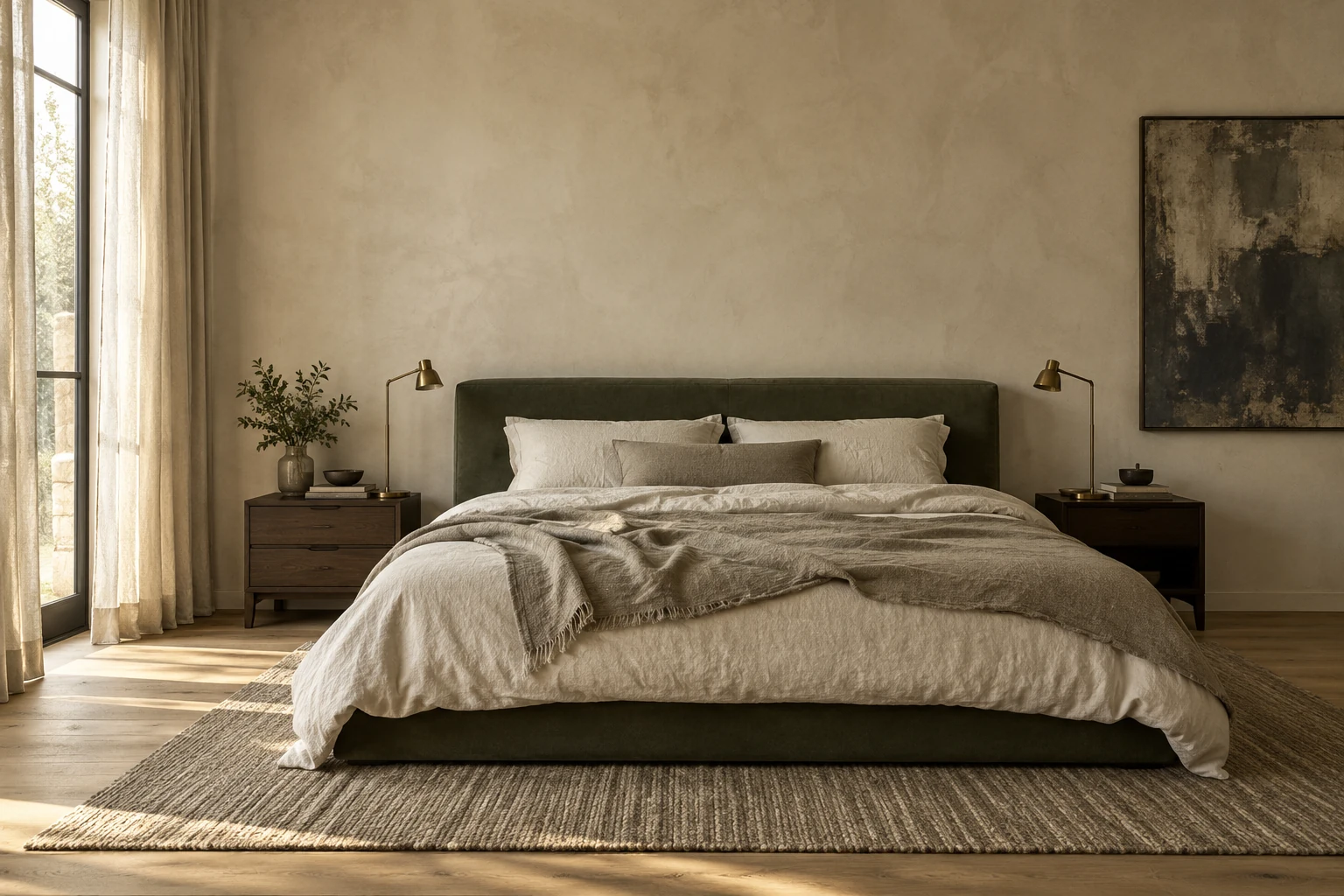
Choose a temperature.
Pale colors can lean pink, yellow, green, or gray. A room feels more settled when its largest surfaces share a general temperature. That does not mean everything should match: it means the differences feel intentional.
Let materials vary.
Smooth plaster next to a loose linen weave gives two similar colors very different roles. Add the fine grain of oak, the pitted surface of stone, or a soft wool rug. The palette stays restrained while the room gains depth.
Keep one dark note.
A dark table, a bronze lamp, or a deep green cushion gives the eye somewhere to land. Use contrast sparingly and repeat it once or twice. A mostly pale room can feel grounded without becoming heavy.
Written for a fictional studio portfolio. All images are AI-created.
Back to the journal